A Hardware Lab Test for Interface Typography
A hardware product can post excellent benchmark numbers and still feel difficult to use. The problem may appear in a BIOS menu where 0 and O look alike, a monitor overlay that becomes unreadable at low brightness, or a companion app that replaces the intended font during localization. These are not cosmetic defects. They slow diagnosis and increase the chance of a wrong setting.
The sensible approach is to test interface typography like another product component. Define the workload, reproduce difficult conditions, record failures, and ship a specification that engineering, design, support, and outside vendors can follow.
Test Objective
The goal is not to identify the most attractive font in isolation. It is to find a type system that preserves meaning across every hardware touchpoint: embedded displays, BIOS or UEFI, desktop utilities, mobile apps, packaging, quick-start cards, and full manuals.
A passing system should make status, hierarchy, numbers, and actions obvious under realistic constraints. The exact thresholds depend on the device, but every team can document the conditions that matter.
| Test surface | Typical constraint | Failure to watch |
| BIOS or UEFI | Dense menus and mixed technical abbreviations | Similar characters, weak selection state, crowded line spacing |
| Device OSD | Small panel, distance, glare, low brightness | Thin strokes disappear and labels become vague |
| Monitoring utility | Live values, charts, alerts, long sessions | Digits jump in width or units lose hierarchy |
| Mobile companion app | Narrow screens and dynamic text | Truncation, fallback fonts, oversized controls |
| Manual and spec sheet | Long tables and multilingual copy | Broken symbols, poor scanning, inconsistent emphasis |
Bench Setup
Use the actual rendering stack whenever possible. A polished Figma frame cannot reproduce firmware rasterization, display density, font hinting, antialiasing, fallback behavior, or the lighting around a physical device. Build a small but hostile test set before reviewing candidates.
minimum supported display resolution and pixel density;
lowest and highest brightness settings;
light, dark, warning, disabled, and selected states;
long labels from every supported language;
real sensor values, error codes, units, dates, and version strings;
slow network or offline conditions for webfont-dependent apps.
Pass One Small Pixels and Weak Displays
Render the smallest approved text at native resolution rather than zooming a screenshot. Inspect open counters in letters such as e and a, stroke survival, punctuation, and the space between adjacent lines. Then repeat the test at an angle, in glare, and at low brightness. A font that looks refined on a high-density laptop may become gray noise on a modest embedded panel.
Do not fix a weak result by making every label bold. That removes hierarchy. Choose a design with sturdy forms, adjust size and spacing, and reserve heavier weights for selected states or warnings.
Pass Two Numerals and Diagnostic Strings
Hardware interfaces are full of values: temperature, voltage, clock speed, fan RPM, memory timings, network addresses, and firmware versions. Test the strings users actually compare. Tabular numerals keep columns stable; clear decimal points and unit spacing prevent misreading; distinct 0, O, 1, I, and l matter in serial numbers and error codes.
| Sample string | What it exposes | Pass condition |
| 68.8 °C | Decimal point, degree sign, unit spacing | All parts remain distinct at minimum size |
| 1,250 RPM | Thousands separator and uppercase units | Value scans quickly without crowding |
| 0x10AF and O10A | Zero versus capital O | Characters are distinguishable without context |
| BIOS 1.12.0 | Periods and repeated numerals | Version segments retain clear rhythm |
| 12.1 V 4.95 V | Column alignment | Changing digits do not shift adjacent labels |
Pass Three Hierarchy Under Load
Load a screen with the maximum plausible number of controls, values, helper lines, and alerts. Then check whether users can still identify the current state, the primary action, and the consequence of a change. Typography should work with color and layout, not depend on color alone.
“If a user must reread a warning to discover whether it reports temperature, voltage, or fan speed, the interface has already failed its fastest benchmark.”
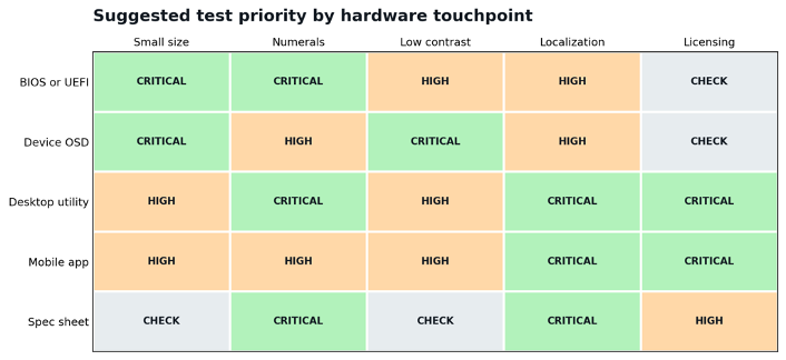
Figure 1. An illustrative priority matrix for planning tests, not measured product data.
Pass Four Localization and Fallbacks
Translate the longest labels first, not last. German compounds, accented Latin text, Cyrillic, CJK, Arabic, and other scripts can change width, height, direction, and baseline behavior. A fallback may cover missing characters while producing visibly different weight or spacing. Test mixed-script product names, units, and model numbers in the same line.
Also verify text expansion with accessibility settings. If a 200 percent text size causes labels to overlap icons or pushes a destructive action off screen, the layout and type scale need another pass.
What Two Technology Cases Demonstrate
Sartorius and Complex Equipment
Sartorius supplies pharmaceutical and laboratory equipment, where a type system must support dense technical information and consistent brand communication. TypeType produced a deeply customized version of TT Norms® Pro for the company. The relevant lesson for hardware teams is that customization can begin with a proven family while adapting the result to specific product and brand requirements.
Plugsurfing and a Connected Service
Plugsurfing develops a mobile app for finding EV charging points and uses a customized TT Fors. Its experience is relevant to connected hardware because the customer journey crosses physical infrastructure, maps, live status, accounts, and payments. Typography must remain coherent even when the product is distributed across device-adjacent screens rather than one enclosure.
Teams that need to compare commercial families with custom development can use TypeType to test candidates and review customization options, then bring the shortlist back to the hardware bench.
Licensing Is Part of the Bill of Materials
A font license defines where the files may be installed, embedded, served, and shared. Treat it like a software dependency: identify every target before release and retain the license terms with the design system. A desktop license used to create a manual does not automatically grant permission for webfonts, mobile apps, firmware embedding, or distribution to manufacturing partners.
| Deployment | Question to resolve | Safe practice |
| Designer workstations | How many users may install the desktop files? | Track named users or licensed seats. |
| Product firmware | Is font embedding in shipped hardware permitted? | Describe the device family and distribution volume. |
| Web dashboard | Does the web license cover domains and traffic? | Deploy only supplied web formats. |
| Companion app | Is a separate app license required? | Confirm each operating system and product. |
| OEM and manufacturing partners | May third parties receive editable files? | Use approved output files or licensed access. |
| Custom typeface | Who can modify and reuse the source files? | Record ownership, exclusivity, updates, and scripts. |
Failure Log
Testing only on the best display: High resolution hides weak hinting and thin strokes.
Using placeholder text: Lorem ipsum never exposes real units, codes, or long translations.
Judging screenshots instead of firmware: The production rasterizer may change spacing and weight.
Encoding status with color alone: Warnings disappear for some users and on poor displays.
Licensing after launch: Teams discover too late that embedding or vendor sharing is not covered.
Checklist
All required characters render without unintended fallbacks.
Critical numeral pairs and error codes remain distinct.
Text survives the smallest screen, lowest brightness, and longest translation.
Hierarchy works without relying on color alone.
Values align in live tables and do not jump as they update.
Font files load within the product performance budget.
Every deployment and third-party user is covered by the correct license.
The final specification records sizes, weights, spacing, fallbacks, and prohibited uses.
A typeface does not need a synthetic benchmark score. It needs evidence that it preserves meaning in the hardware conditions customers will actually face. Once typography passes that test, it stops being a finishing touch and becomes a reliable part of the interface.